WOLVERINE | Brand Evolution

After years of status quo, the brand lacked grit. Whole-Brained gave it a fresh injection of testosterone by shifting the point of view from retail manufacturer — to real man. Inspired by “common interests” that all men seem to share, regardless of segment, Whole-Brained evolved the core identity, created an icon, and adapted our new thinking about the brand to events, promotions, environments, and a family of subbrands.

Core brand book: This simple brand book embodies everything Wolverine stands for. Anyone can quickly read it and understand the important ideas behind the brand.

Brand icon: The “claw” succeeded where a previous “pawprint” had failed: evoking the emotion of the brand through the ferocity of a real wolverine, and literally “branding” products.

Core brand manual: Going beyond the usual logo and color rules, we included tone of voice for copy, guidelines for store branding, and icon placement on products.

Core brand print ads: The rugged new look was launched with “kick-ass” print, radio, and web on ESPN media.

Rugged outdoor shop: We helped Wolverine transition the brand from work into rugged outdoor by creating a related look under the same brand name—without creating a subbrand that would sacrifice the strength of the original. The shop design is a “kit of parts” that can be put together almost anywhere.

Rugged outdoor packaging: A variation on the palette of colors and materials from the work category… yet still clearly the iconic Wolverine brand.

Rugged outdoor box lid liner: Relating the ferocious brand essence to comfort, another thing Wolverine is known for. Not an easy task. But we did it.

Rugged outdoor hang tags: In a world flooded with visuals, we still want to people to be able to read about a great product. Inserts inside branded hang tags give product details.

Trade show design: A formerly generic trade show space was transformed into an authentic expression of the brand.

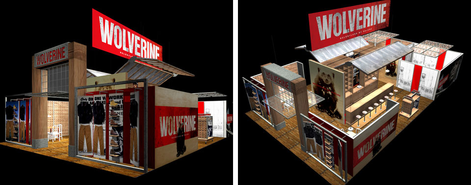
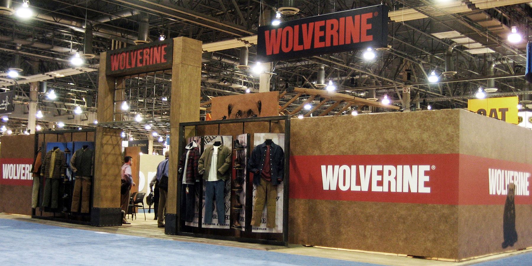
Trade show exterior: Celebrating key brand materials and elements. “Flipper” panels pivot to exhibit footwear and apparel or graphics.

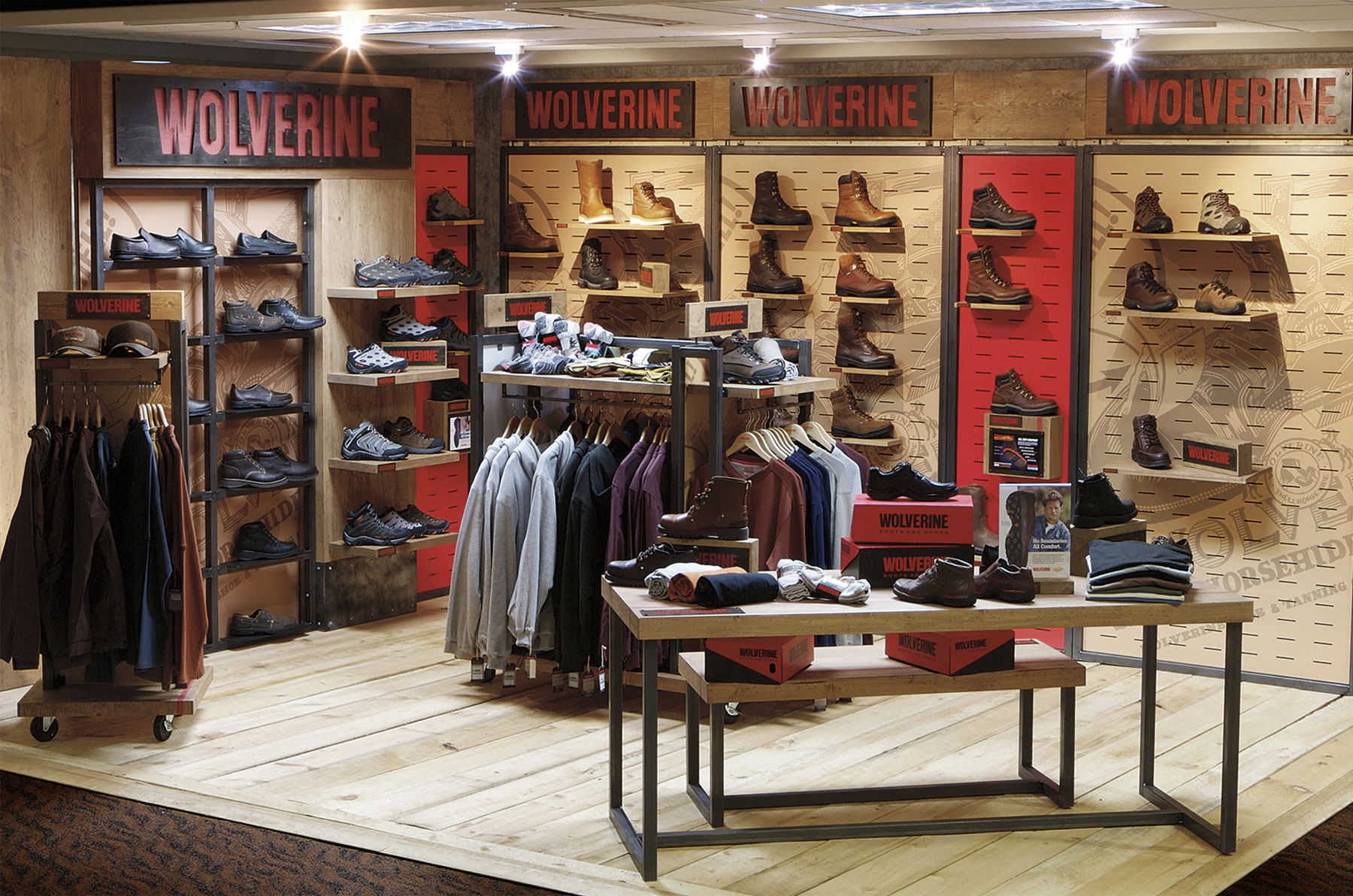
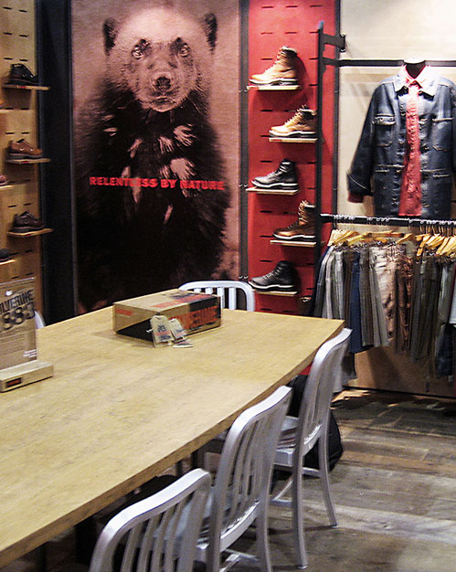
Showroom workspace: An efficient fixture system and brand-right tables and chairs. Background graphics tell the story without intruding. This space works!

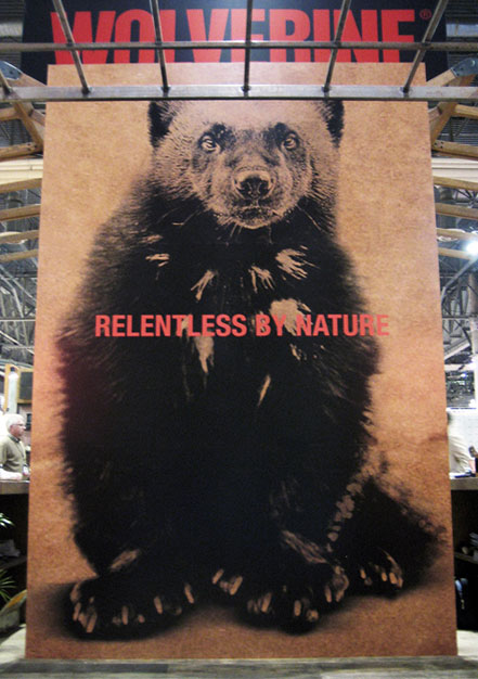
Trade show entrance: The two-story high graphic makes the brand feel larger than life — and makes the booth easier to spot from afar.

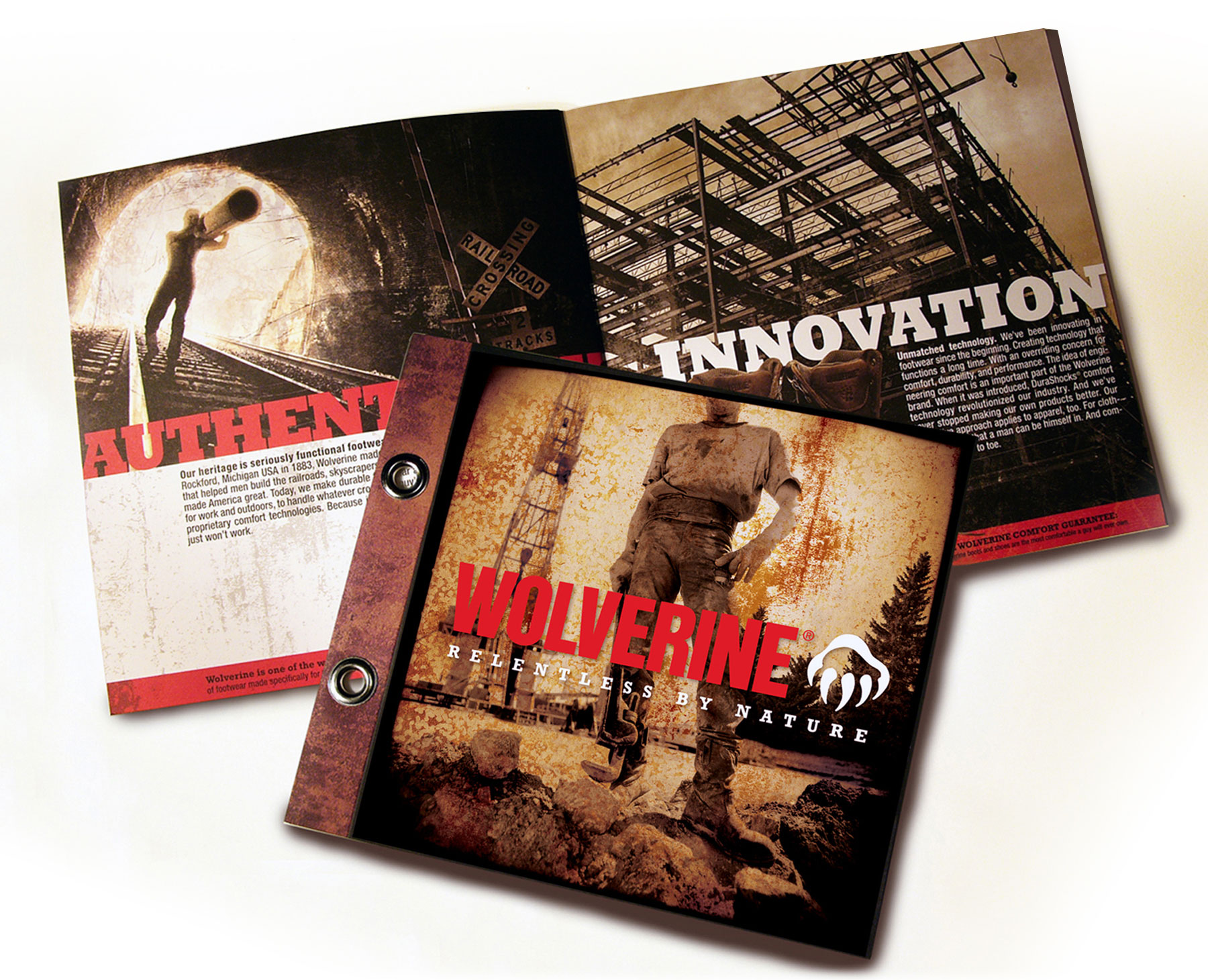
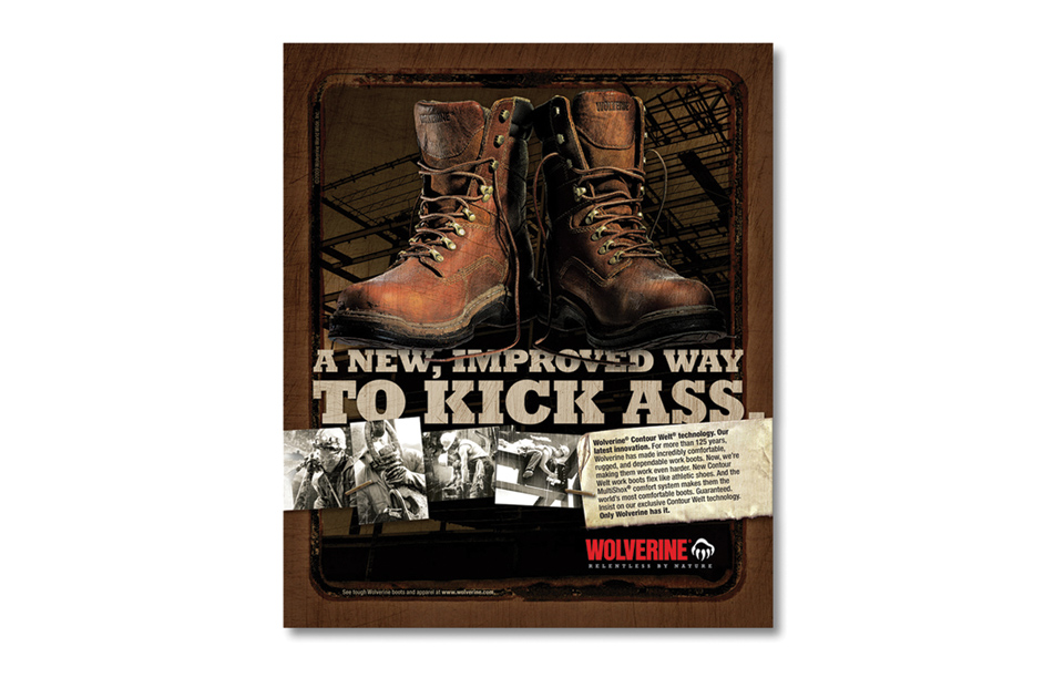
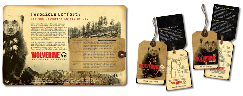
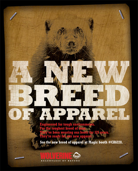
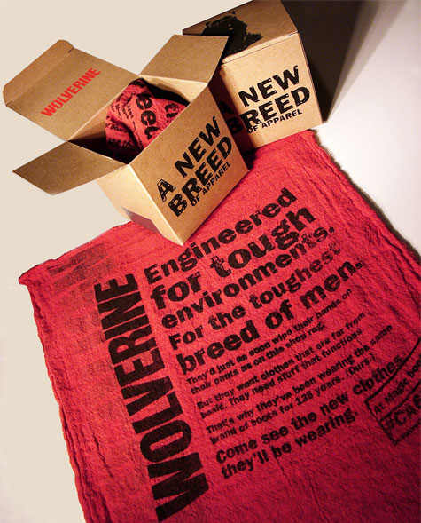
Apparel awareness campaign: Print ad helps retail buyers connect the tough new apparel line to the brand. Dimensional mailer was printed on a shop rag… because the Wolverine consumer would as soon wipe his hands on his pants as the rag.

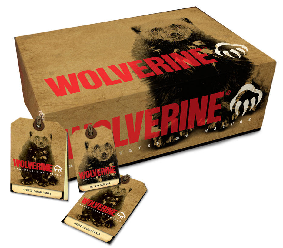
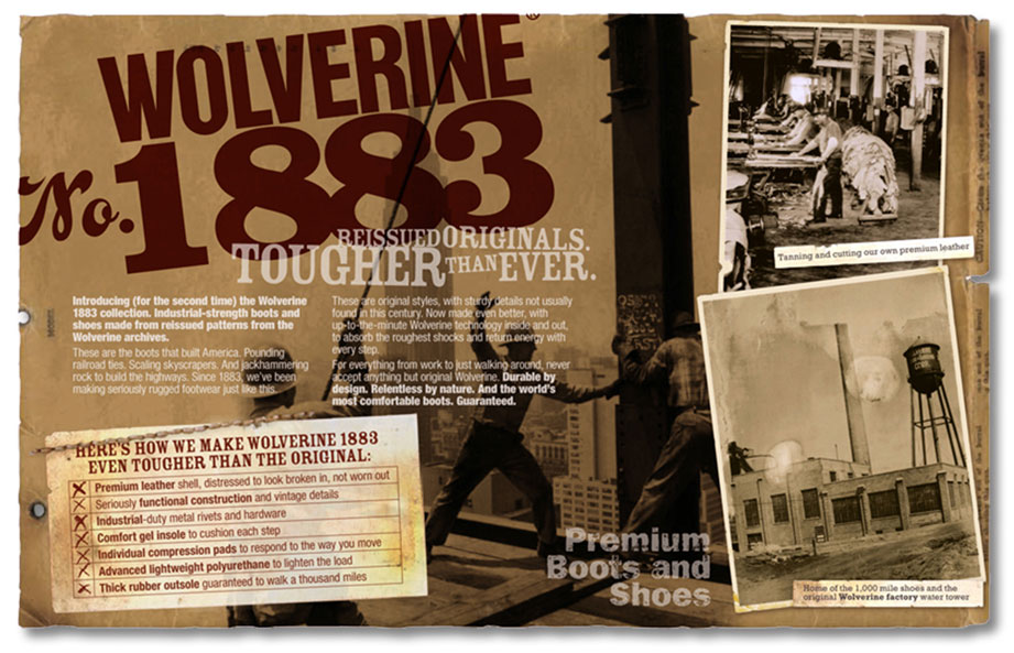
1883 box liner: For a subbrand of footwear made from archival patterns, a great place to claim the authentic American history of the brand—a story that otherwise would go untold.

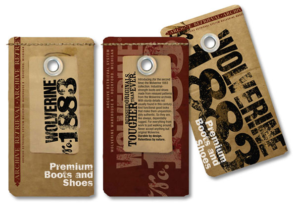
1883 tags: “Archive retrieval” tags look like original warehouse issue. Modern touches, like the white type, bring the new brand into the present.

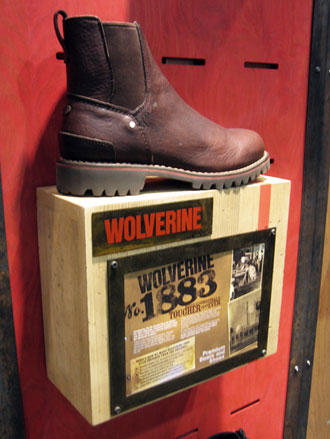
1883 hero shelf: Shoppers get the story from this industrial-strength shelf, wherever the brand is presented.

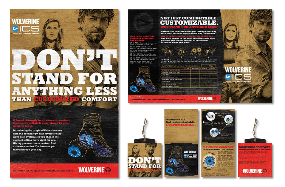
iCS campaign: A fellow who looks like Dirty Harry crossed with Walker Texas Ranger transforms iCS comfort technology from lifeless product feature to personal entitlement—in point of sale, box lid liner, and hang tag system.

Return to Work Landing Page